How To Update A 1940s Bungalow With The Utmost Style
Share News:
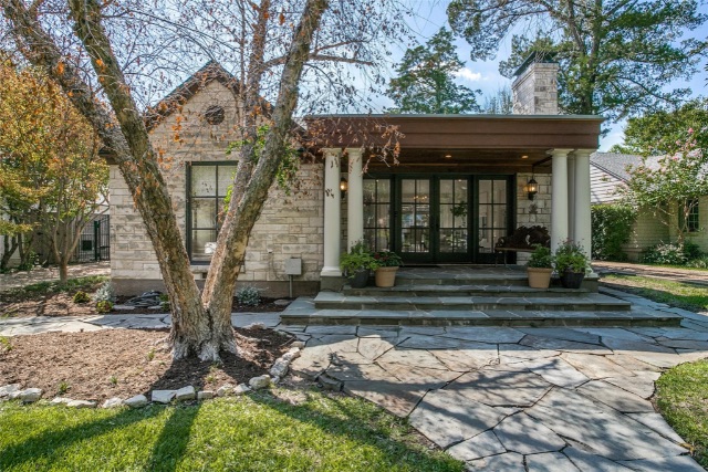
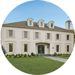
How do you even update the most incredible 1940s bungalow that could easily be described as Hill Country Chic? Set on the tree-lined street of your dreams, with an exceptional layout and all the windows you can handle? That’s the question homeowner Christi McCrary asked herself a very short time ago when she set out to reimagine her space. A space that was already pretty incredible, but now it’s extra incredible.
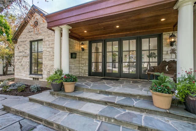
McCrary had a vision and she teamed up with Custom Transitions’ Laura Whiteford to bring it to life. I can call out one million details as to why this house is literally the living embodiment of everything done right in my life. But instead, I’ll hit the hot list of McCrary’s dos-and-don’ts because if you’re entertaining a remodel and want one of this caliber, these guidelines will serve you well. In no particular order, here you go.
Remove any paint color with yellow undertones. You heard it here. Creamy doesn’t always equal dreamy. If you want a fresh space, go with whites and neutrals that head in a non-yellow direction. Totally makes sense since “yellowed” by the very definition equals older.

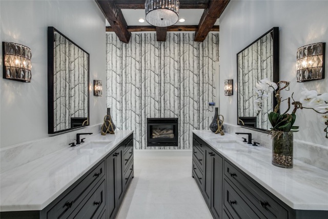
Bring a fresh take to an era-appropriate trend. In the bathroom, McCrary used whimsical wallpaper with a birch outline. She tied into the 1940s design element of wallpaper but updated it with a current pattern. I love it because it ties to the tree-lined lot. McCrary loves it because since there isn’t a door on the Primary Bathroom, the minute you walk into the primary bedroom, you get a sneak peek of what’s to come.
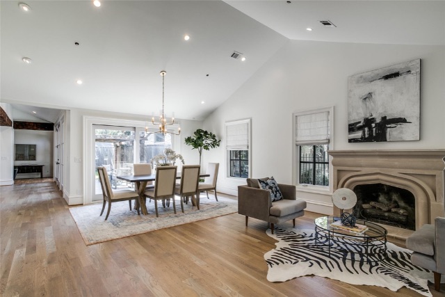
Fare thee well, Original Hardwoods: McCrary said she understands that most people love an original hardwood floor, but the look she was going for was completely updated so she swapped those skinny planks for a more modern wider plank.
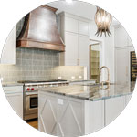
Custom cabinets are a must. This is a hard and fast rule for McCrary. Her thinking is why go to the expense of a completely custom update and then not complete the look with custom cabinetry that fit the size (and look) of the space?

Non-uniform tile. I don’t even know if that’s the right way to phrase it, but it’s such a total DUH detail. The bathroom with the wall of tile with varied blue tones creates something special. It’s elevated. It looks rich, adds texture and interest, and McCrary’s favorite thing? It mirrors the movement of water. CLEVER.

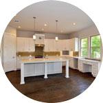
Make smart spaces. McCrary said the front half of this home had the original layout with smaller closets and not the BEST use of space for today’s luxe living. She reconfigured the space to give it a more open feel and also help it make the most sense. By combining two closets she was able to create a wonderful walk-in in the front bedroom and then found unused wall space to create the hall closet we all need today.
Wherever possible, raise the doorways. McCrary said the back half of the house (which was an add-on at some point), had higher doorways so when she had the opportunity, she added height to the front doorways as well. Not only to create a uniform look but also to add to the open, flowy feel of the home.
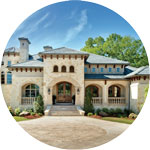
Solid tips and tricks that apply to just about any remodel you can imagine. Now if you’d like to see the finished product in person, Dave Perry-Miller’s Frada Sandler currently has 4316 N. Cresthaven Road listed for $1.75 million and an open house scheduled from 2 to 3 p.m. Sunday, Sept. 25.