A Nip And a Tuck For an Iconic Lionel Morrison Modernist
Share News:
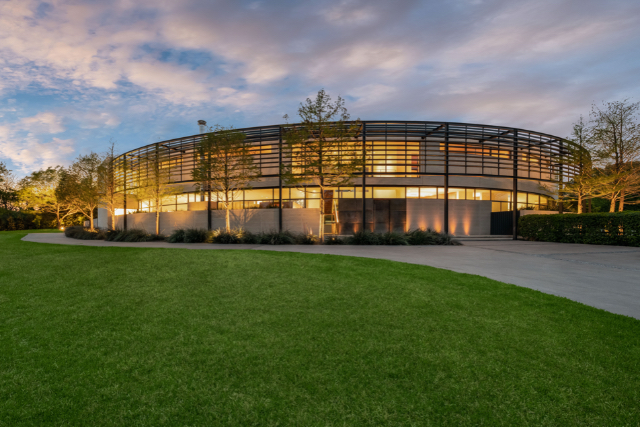
Dallas has a handful of homes you might consider “iconic.” This architecturally significant modernist is certainly one of them.
It was a custom design by Lionel Morrison, well-known for his contributions to our architectural landscape. However, even an architectural masterpiece needs a nip and a tuck after 15 years.
Fortunately, Brad Oellerman, president of Crescent Estate Homes, entered the picture, bringing in designer Brant McFarlin. Together they made brilliant design decisions because that’s what they do. Some are so subtle that even if you know the property well, you won’t notice immediately.

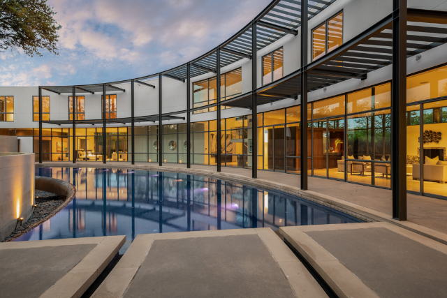
I couldn’t pinpoint why the exterior looked different, and then realized it was down to shrewd paint and landscaping. You won’t see what I mean unless you compare side-by-side photos, so I’ve included a before shot. The white trim paint was replaced with a dark color outside and inside. Areas of the exterior that were a cream color are now bright white and the bright white continued inside. It’s so simple and so effective.


DDLA Design was engaged to create a new landscaping plan that included planting an enormous hedge across the front perimeter of the almost two-acre corner property to provide privacy. A section of the back wall behind the pool was removed to provide better sightlines to a magnificent heritage tree.
I think the most profound difference was the complete redesign of the kitchen.
We’ve had enough of completely open-plan kitchens, but we still want to know what’s happening. The new design offers the best of both worlds. A wall was created that is open on both sides and in the middle, essentially framing the kitchen just enough that you can still feel like part of what’s going on and have a bit of privacy.


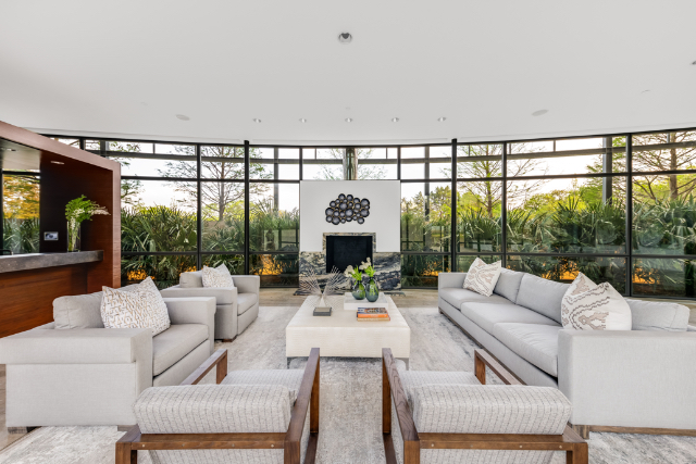
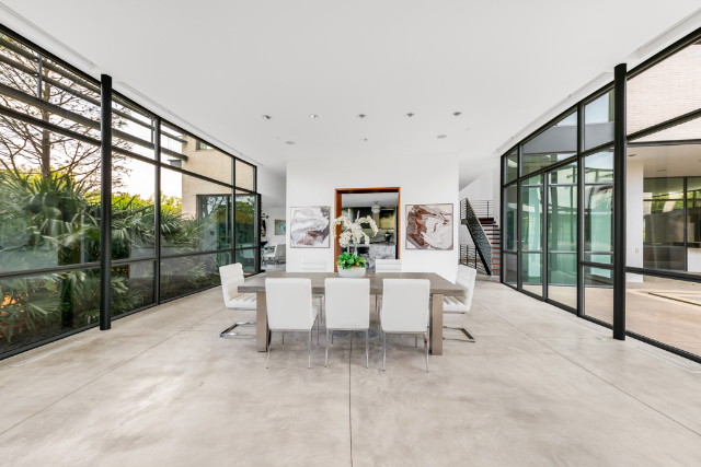
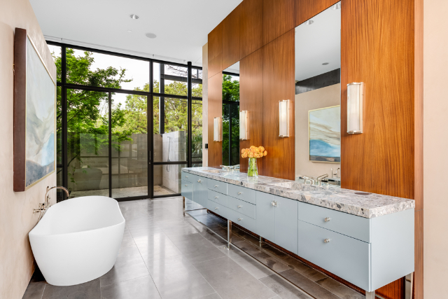
The 14,795-square-foot modernist with six bedrooms and nine bathrooms has everything you can imagine. There’s a super-cool wine room, a home gym, a game room, and an upstairs office with a spectacular view.
It’s a home you have to see to appreciate fully. And it’s so much easier to appreciate it because Oellerman understands the value of staging.

He brought in George Bass Stage and Design to make this property resonate with buyers, and as usual, Bass and his team did a spectacular job. When the home was previously on the market, I could not get past the fabulous designer furniture because the colors overtook the architecture. It was a can’t-see-the-forest-for-the-trees issue. So when I walked in last week and saw it staged, I could appreciate the architecture and updates I had never noticed before.


“There was so much personality in the furniture. It was hard for a buyer to appreciate the architecture if that furniture is not their style,” Bass said. “We have to have some neutrality for selling. I wanted to introduce some large serene pieces because it is a serene and quiet house. We did not want to compete with an architectural marvel but rather enhance the rooms and convey comfort so a buyer can understand how the house lives. You can always have some fun furniture, just not in every room.”

Modernist residential architecture is here to stay and gaining ground daily because it offers a quiet, elegant counterpoint to living in a noisy and often overwhelming world.

Compass Real Estate’s Amy Detwiler just listed this modernist dream at 6645 Northaven Road a few days ago for $10.9 million. I think a bidding war may ensue with the new look, so line up!


O.M.G. Painting the trim black on this house has got to be the most obviously TRAGIC idea ever. Maybe we should paint the trim of the White House black – you know, because it’s been white for over 15 years, so it needs an “update”. BARF!!!
Ha Ha Ha! bjf, i like you. Agree though, I don’t feel like the dark paint is an improvement – I find it distracting and detracting from the overall design. It makes the home look as if it’s in a cage… or under scaffolding… or like a commercial sports arena…
I live nearby and love the updates and the new landscaping. The house feels more connected to the nature around it with the dark brown/bronze railings vs the stark 1980/90’s looking all white contemp. Not trendy updates but classic modern touches in step with Phillip Johnson’s Glass House.
Now I’m going to have to drive by there just to check out the new trim.