Be-snore And After: Plaza I Builder’s Beige to Rich Renovation
Share News:

New blood. That’s how neighborhoods change and progress. Child-friendly neighborhoods mature, children grow and leave, parents downsize, younger families move in – all very Lion King. High-rises have the same issues, but while interior renovations are under an owner’s control, the common areas are subject to the cheapness or largess of the community.
I’ve said in the past that Plaza I and II didn’t appear to be keeping up with other high-rises when it comes to renovation. That’s apparently changing. The sallow hallways are about to be refreshed with the outdoor Pavilion already complete.
One thing that doesn’t need a renovation is the view over the Mansion Park area of Oak Lawn. All that green you see to the right? It’s the yard for the modern home behind it. It’s like being across the street from a park. I know at street level, it appears to be an empty lot waiting for a mansion to land on it, but nope, it’s green space just for you (sorta). If you’re wondering about the coming Toll Brothers building, fear not, it will be out of sight around the corner.
On the inside, I had the pleasure of touring a gutted and renovated unit 501 with listing agent Sue Krider from Allie Beth Allman priced at $674,000. Krider knows CandysDirt.com readers thrill at seeing a good renovation, but before we get to the goodies, this unit contains 1,305 square feet within its one bedroom and one full and one half bathroom footprint. (I like to put all the details in one place for when you fall in love.)

Before: Study doubled as a sleeping pill.
The door opens to a hallway with a study immediately to the left. It’s a nice-sized room with an equally nice closet. But gosh was it bland.
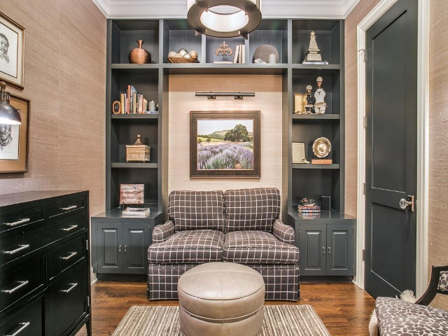
Enter an owner with some taste, and voilà. A sterile room was turned into a useful hideaway with built-ins, grass cloth wallpaper and contrasting paint. An often useless double closet door has also been reduced to free up wall space and make the room feel less like an anteroom for a closet.

Entry (Front door behind photographer)
There’s also a bit of useful fun lurking here as well. As I said, you enter into a hallway. This living space has double doors leading to the hall that act to disappear the wall. When seated in the loveseat, you’re facing this credenza with a TV placed above. With the doors closed, it’s a retreat. But opening them adds a snuggle-worthy hideaway for popcorn and movie date nights. It’s really quite a clever use of space (that I expect neighbors reading this will copy).
As you can also see, at the far end of the hallway is the bedroom, but before you get there, on the left there is a laundry closet with full-size hookups as well as the half bathroom. The doorway leading to the right takes us into the main living, dining and cooking spaces. I have to say, I usually hate wallpaper, but I really think the tone of grass cloth used brings a richness to the spaces.
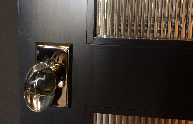
Before we go further, the difference between good and great renovations often comes down to the little finishes. The owners of this unit clearly share my ideals. All the doorknobs have been replaced with crystal egg-shaped knobs with polished nickel accents. Very spiffy. Also, the shot above is of the bedroom door. You’ll notice it’s a reeded glass door that gives privacy while transmitting light. More niftiness.
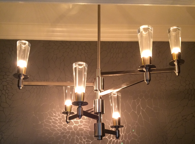
Niftiness continues in the half bath. I typically “ick” at the girly chandeliers popular in powder rooms, but this one I like … a lot. I admit to being a pinch in awe when I opened the door and saw this fixture. The room’s wallpaper reminds me a bit of a tone-on-tone giraffe pattern (understated luxe).
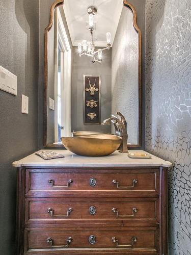
While I’m sure you can imagine a toilet, the vanity continues the understatement that signals refinement. And for you ladies who may have thought the chandelier was a little strong, the vanity and mirror brings in some lady parts so everyone is happy and balanced. (Ying yang, ping pong, you get the idea.)

Living, dining and kitchen (definitely) before
The original configuration of the main living areas was pretty stock. An uninteresting ceiling accentuating the alleyness of the room, and on the right, a doorway leading to the bedroom from the living room. Behind the photographer are the windows with great green view.
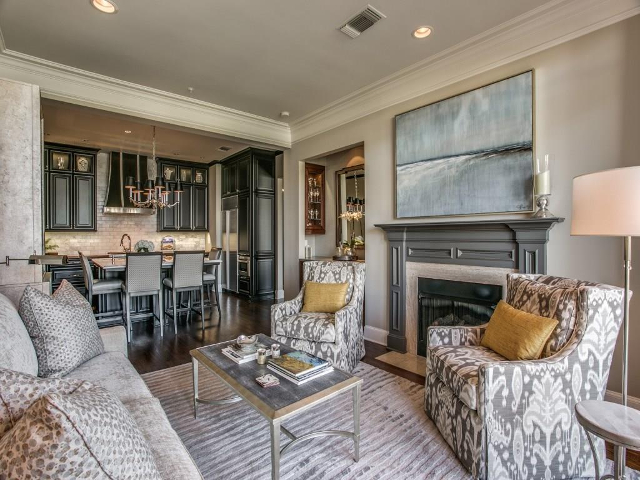
What a difference, huh? The door to the bedroom has been relocated to the end of the entry hall (with that glass door). Moving the bedroom door makes the room feel homier than when the bed was visible from the sofa (like an apartment). A beam visually separates the living room from the cooking and eating area.
The kitchen and dining area felt cramped with the kitchen separated by a half-wall “hiding” a sink and beige cabinets. Here you can see that the openings from the hallway and the bedroom took up a lot of wall space that was subsequently better utilized.
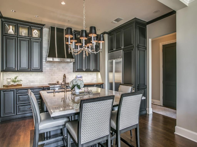
The dining area is now part of an incorporated island that seats four while doubling prep space. Relocating the bedroom door allowed the entry from the hall to be shuffled down a bit to give the kitchen more space. And I will say that seeing the richness of the cabinetry here makes me think the white kitchen’s days are numbered. I also like the glass-fronted, to-the-ceiling upper-upper cabinets to show your perfectly-framed baubles. It sure beats the current open-shelf trend that just gets your dishes and doodads dusty and dirty.
You’ll also note that on this side of the beam, the crown moulding has been simplified, ringing the area in the same cabinet tone.
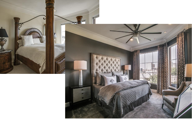
Isn’t it amazing what carpet, drapes, a pot of paint and appropriately-sized furniture can do for a bedroom? This is a bedroom to entertain in … so to speak.
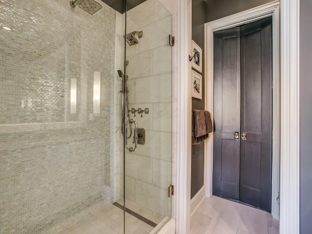
The full bath went from builder’s beige to pretty wow. Imagine a sink and toilet on the other side so we can talk about the shower. In an era of large format tile, it’s almost dazzling to see the shimmery smaller tile used across the back of the shower. If all the shower heads and gizmos don’t perk you up in the morning, the tile will. The split door leads to a walk-in closet.
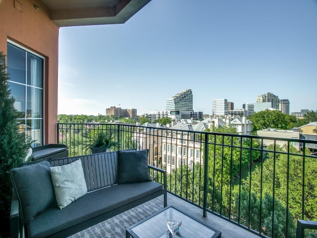
One final peek at the view and outdoor space. How many city-dwellers can say they have a view of mansions and a quasi-park out their windows? You can if you talk to Sue Krider.

One of the views from one of the patios in Colorado
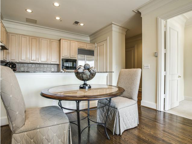
One final note. The owners’ primary residence is just south of Fort Collins, Colorado, with Dallas acting as their pied-à-terre. Now both are for sale as they up sticks for Florida. So if you want to do some real estate stalking or you simply love the owner’s taste and want to live in their shoes, have a look at their other home. It’s a 6,799 square footer with three bedrooms and three full and two half bathrooms that’s currently listed for $2.75 million.

Remember: High-rises, HOAs and renovation are my beat. But I also appreciate modern and historical architecture balanced against the YIMBY movement. In 2016 and 2017, the National Association of Real Estate Editors recognized my writing with two Bronze (2016, 2017) and two Silver (2016, 2017) awards. Have a story to tell or a marriage proposal to make? Shoot me an email [email protected]. Be sure to look for me on Facebook and Twitter. You won’t find me, but you’re welcome to look.


Gorgeous unit! And I’m glad to hear the common areas are getting an update.