Pantone’s 2026 Color of the Year: Designer Niki Samuel on Why Cloud Dancer Feels Inevitable
Share News:
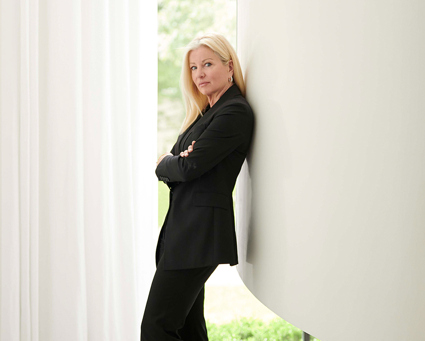
When Pantone announced its 2026 Color of the Year, Dallas interior designer Niki Samuel didn’t blink. “It’s about time,” she says. “White has always been my favorite color. My grandkids think I’m so boring.”
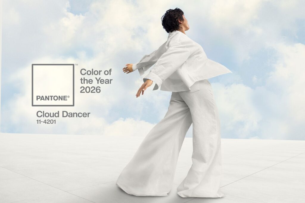
Pantone’s choice — Cloud Dancer (PANTONE 11-4201) — marks the first time the Color of the Year program has named a shade of white. In a design world fueled by bold statements and fast-moving trends, designers largely agree it’s long overdue.
For Samuel, white has never been about neutrality or playing it safe; it’s about clarity.
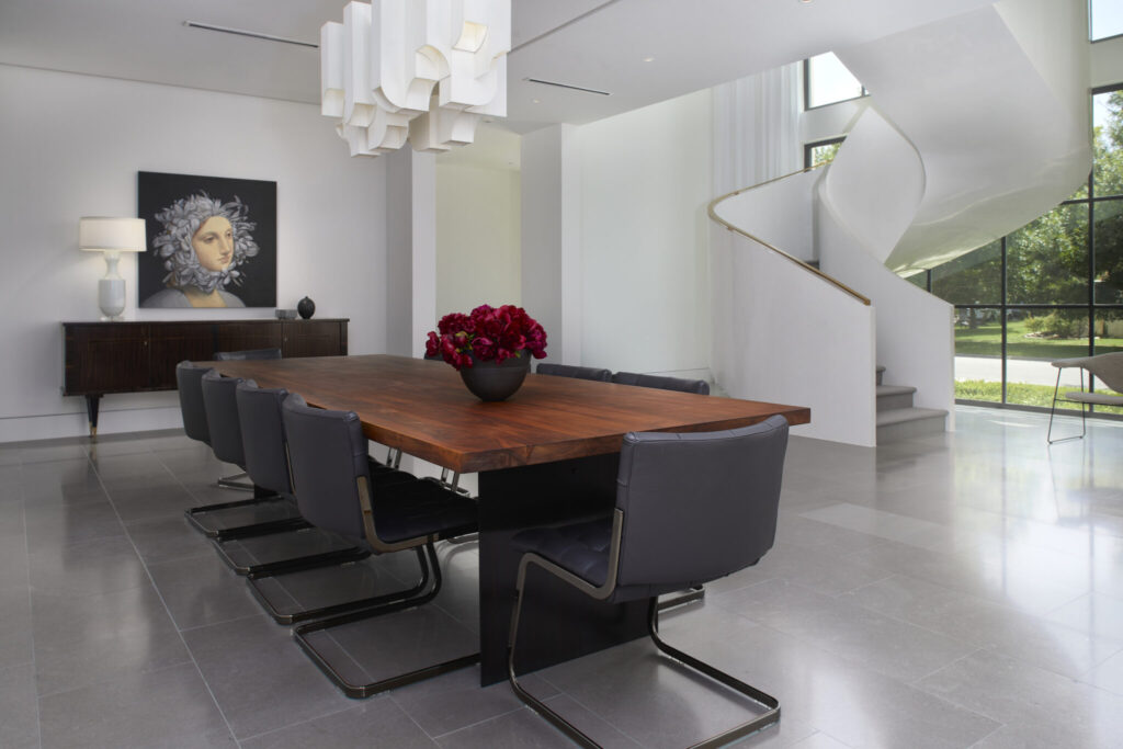
It’s a philosophy that guides her work at Dallas-based NPI Design. “I need peace. I need my mind to settle,” she explains. “As a designer, you’re constantly processing decisions — proportion, materials, movement, light. A clean palette allows everything to quiet down. It creates serenity.”
Leatrice Eiseman, executive director of the Pantone Color Institute, strikes a similar note when describing Cloud Dancer. “It’s a lofty color that reads like a breath of fresh air — a reminder of the value of measured consideration and quiet reflection.”
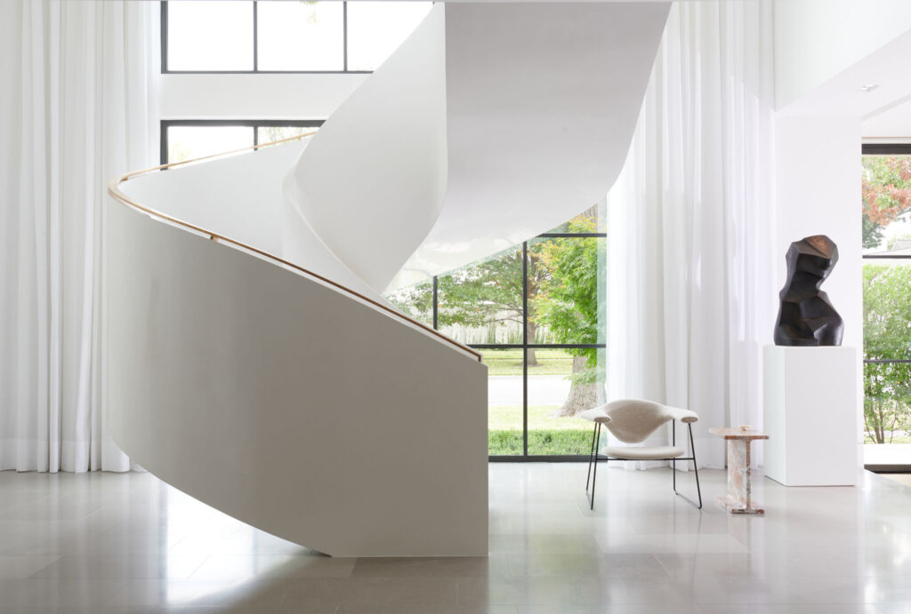
Rather than acting as a statement color, Cloud Dancer is intended to function as a foundation. Eiseman notes that in interiors, it allows texture, form, and materiality to take precedence, creating spaces that feel composed and expansive without tipping into sterile minimalism.

Samuel has applied this thinking for years. “If you don’t begin with a quiet, white palette, the things you actually want to have impact — art, architecture, meaningful objects — get lost,” she says.
“You don’t go to a museum and see a Matisse hanging on wallpaper.”
She points to midcentury modern architecture — masters like Frank Lloyd Wright and Richard Neutra — as proof that restraint isn’t boring. “Those architects used glass so nature could be the color,” Samuel explains. “Green trees. Blue sky. What God made. Nature gives us enough color.”
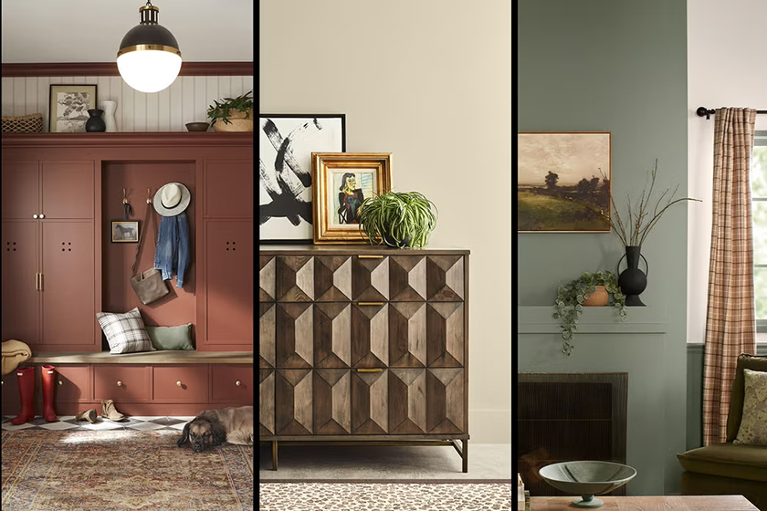
The timing reflects a broader shift across 2026 color forecasts. While Pantone went all the way to white, many major paint brands landed on grounded neutrals and earthy tones — warm browns, softened khakis, deep charcoals — signaling a collective move toward calm, authenticity, and livability rather than spectacle.
Pantone president Sky Kelley knew the choice wouldn’t land quietly. One Instagram commenter put it bluntly: “Your choice is about as inspired as mayonnaise.”
Cloud Dancer was quickly labeled “bleak,” even “dystopian,” with jokes that its lack of color reflected the economy. “Pantone can’t afford color this year—and neither can anyone else.”
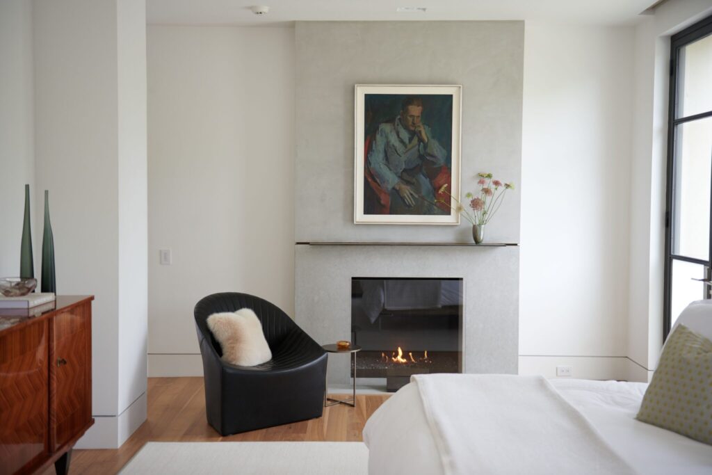
Samuel sees it differently. White isn’t the absence of design — it’s the framework that makes intention possible.
“Art, architecture, the way light moves through a space — none of that works if the background is competing for attention,” she says. “Maximalism has its place. But if you’re creating spaces meant to last, white is where you begin. It may not be flashy. But it never gets in the way.”


Pantone’s Cloud Dancer figure is reminiscent of Jonathan Pryce playing Victor Fox, singing and dancing on clouds, during the opening scene of the 2002 film, Unconditional Love.